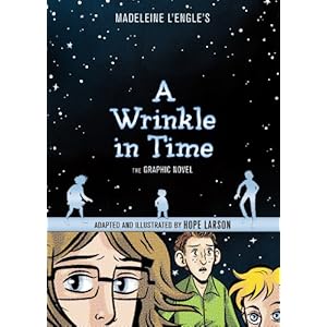
I don't know why I never read Madeleine L'Engle's A WRINKLE IN TIME as a child. Probably the same reason I've never read THE PHANTOM TOLLBOOTH or THE HOBBIT. I tried, but they didn't interest my pre-teen self (and then, once I hit teenager-dom, it was all murder mysteries, romance novels, and historical fiction. Bonus, if it was all three at once. I'm looking at you, Nora Roberts and Danielle Steele.)
But, back to A WRINKLE IN TIME. I really enjoyed the book. I don't have the original to compare it to, but I understood the story and didn't feel like anything was missing. Of course I have questions, but if you've seen my {Deep Thoughts} posts, you know I often have questions about what I read.
I really liked Hope Larson's illustrations. Once I figured out the format (top panel, middle panel, bottom, then the big one on the right), the book made total sense. I like that it was only 3 main colors: blue, black and white. The illustrator really has to make their illustrations mean something when they can't rely on color to do it for them.
I am adding this book my my (growing) list of books that I'll be sharing at our May (preliminary) Virginia Reader's Choice meeting. It's a great book for the list for two main reasons:
1. Kids love graphic novels (I love graphic novels), they think its a fun format, but I know that struggling readers can pick this up and feel successful because there aren't as many words and the illustrations really help you understand.
2.) I think it will draw children into reading more classic books.
A WIN WIN FOR ALL INVOLVED!
Here is the book trailer that I found on youtube:


I loved the Phantom Tollbooth and The Hobbit as a child! This book looks really interesting.
ReplyDelete